Lawyers understand the importance of nuance in words and phrasing like no one else. Therefore, they understand how little tweaks on law firm websites can make a big difference. While there is no room for creativity and interpretation in contracts, the best legal website designs go all out to maximize performance.
We have compiled a list of the best practices for a law firm website and examined the top ten law firm websites to see what makes them so effective. Learn what increases and decreases traffic, how to create the perfect layout, what details to include on the page, the basics as well as unique branding strategies. These are the tips for great law firm website design illustrated with real-life examples.
1. Top Legal Websites Include Contact Information on Every Page
The best law firm websites aim to attract future clients – and contact information assists with this task. In fact, contacts should be the easiest piece of information for a visitor to find.
It is not limited to the “About Us” section. First, it should be clearly seen on the homepage. It can then be included on specific pages, perhaps, with varying contact information depending on the lawyer. Top legal websites give their visitors a range of channels to get in touch with you: phone, call back number, e-mail, and messenger.
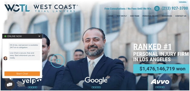
The first of our top 10 attorney websites are West Coast Trial Lawyers. One of the first things you will notice on the homepage is the firm’s phone number. The line “Free consultations / No fees until we win” right beside the number sends a powerful message and shows their confidence. It also makes visitors less intimidated so they will be driven to make a call:

This list of top ten law firm websites will be incomplete without The Roulston Urquhart Criminal Defense. Their front page also sends a powerful message. They employed a smart approach to get your attention with a slogan in large letters and provide you with their contact info right below. This is how modern law firm websites should be – simplistic, bold, and actionable:

2. Top Lawyer Websites Have a Simple Interface
As a continuation of the point above, the best legal website designs are responsive and intuitive both on desktop and mobile versions. This is illustrated through the following characteristics:
- There are enough links for navigating the pages but not too many.
- The best law firm website design is always readable. This includes optimal fonts, sizing, color combinations, and use of negative space.
- Flashy animations, popups, and audio and video content are kept to a minimum. They don’t translate well to mobile versions and might annoy visitors.
The best lawyer website design in this category, in our opinion, is the Bhatt Law Group. They managed to include multiple features and smart branding into a sleek design. Even though they give a lot of information on one page, it is structured in an easy-to-comprehend way. Pay attention to their color choice (contrasting orange and black) and copywriting that prompts user action (clickable CTAs).

The top ten law firm websites show how a homepage may contain many specialties that a firm offers. They can even incorporate specific attorneys specializing in a certain field of law. Giving leads the right resources to the right place, and the right time moves them through the funnel more efficiently.
3. The Best Law Websites Have Optimized Contact Forms
Like other best law firm websites, you don’t want to overwhelm your visitors with extensive forms. If you ask for the necessary information and provide only essential information about your firm as well, there is a better chance that your potential client won’t back out.
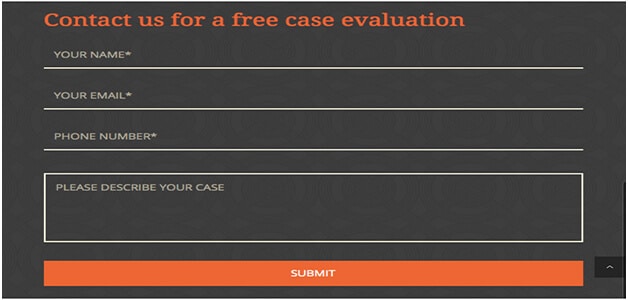
For a top 10 legal website, we recommend a simplified contact form asking for a name, email, or phone number and a short explanation of their issue. Visitors will quickly fill out this form, and the rest can be sorted out during the first consultation. Top law firm websites include a simple scheduling form where they can select the date and time. This way, you cut the time spent on scheduling details over the phone.
Take these lawyer website design examples for contact pages. These small law firm websites teach you how to achieve effective simplicity – the first website is literally called Small Law:


By the way, Small Law is considered one of the best solo law firm websites even with their limited recourses.
Another good contact page from Bhatt Law Group:

4. Top Law Firm Websites Maintain Their Blogs
The best law websites are constantly being updated with new content, educational articles, success stories, etc. Updated blogs on law firm websites drive organic traffic to the site from search engines. Even if a website was considered one of the best attorney websites, let’s say, in 2017, it might be long forgotten a couple of years later. The Internet moves with insane speed, and law firm websites need to keep up with it.
These two-attorney website examples show what kind of law firm blog content you can post on a blog.
Moving further along on our top ten law firm websites, YLaw Group:

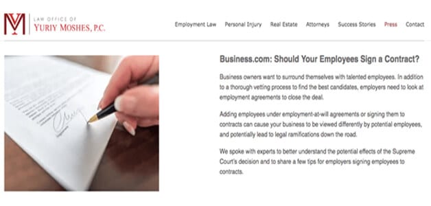
Moshes Law, P.C.

[disclaimer: Law Office of Yuriy Moshes – employment lawyers NYC – is a client of Lasting Trend]
Top legal websites include relevant keywords to the articles to maximize a law firm website SEO impact of the blog. However, there is a fine line between using a sufficient number of keywords and stuffing. If you go overboard, keywords will quickly create the opposite effect. Another tip is to maintain regular uploads and make a reasonable schedule that you can follow.
Even the best law firm websites struggle with blogs and site content in general. Lasting Trend takes away the confusion and teaches you how to be a step ahead of the competition. Let us be in charge of your website content while you focus on other areas of your company.
5. Best Attorney Websites List Their Services
The best lawyer website design showcases what the firm specializes in. A visitor should be able to take a glance and figure out whether you provide the services they need. The longer visitors need to browse the law firm’s website for that information, the more likely they will click away. You don’t want to be vague or barely mention specific fields of law – this will make you less professional and credible. The list of services on the best attorney websites will make it clear whether a particular situation is a good fit for your firm.
The list can be displayed on the front page or navigate to a separate page. One of our top attorney websites the Mendini Law uses the second approach:

6. Best Law Websites Include Call-to-Action
Having good content is a must, but you will multiply its effect. The best law firm websites always make use of every strategic SEO trick. Determine what you want from future clients and translate that into non-invasive CTAs. People often don’t realize they are being “called to action” so the best attorney websites know how to seamlessly encourage people to contact them, fill out a form, select a service, etc.
Our next picks for top 10 attorney websites are Counsel for Creators and Laureti & Associates:


7. The Best Law Firm Design Integrates Social Media
Top attorney websites know that their potential clients are already on social media. Because social media for attorneys is a great traffic diversification strategy. The best law firm design integrates social media accounts into the layout, thus, expanding the reach. These days, this rule applies to any company, but when your main line of the business depends on a continuous increase in customers, your social media needs to be prominent.
If you are not sure where to start, Lasting Trend will implement the best practices for a law firm website. We know how to complete social media profiles for the best results and how to seamlessly coordinate different digital marketing campaigns. Starting with Facebook, Twitter, and Google+, we will include these links on the website so that your clients will have several channels of communication. And this will just be the beginning of our extensive work to create the best law firm design.
A couple of top lawyer websites are Parris Law and Hodgson Russ LLP. The screenshots below show how you can include social media for attorneys in a non-offensive way. Since most people already know what logos of popular platforms look like, they will be enough.


8. Best Law Firm Websites Share Customer Testimonials
When people can see what past clients say about their experience, it makes you more trustworthy and credible. Top lawyer websites always include them because, according to research, testimonials and case studies are considered the most effective content marketing tactics.
It can be intimidating to search for law firm websites since there are no guarantees, and customer testimonials give potential clients peace of mind. Or you can group them in an interesting way, like some of the best law firm websites; for example, “2018 customer testimonials”.
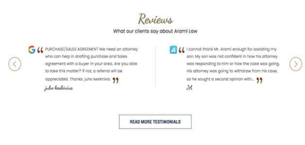
Arami Law Office makes our list of top 10 attorney websites for their presentation of testimonials. Not only do they show them directly on their front page, but they also have another page solely dedicated to them:

9. The Best Law Websites Use High-Quality Photos
The top 10 legal websites use the highest quality, highest resolution photographs you can get your hands on. These days, online users, first and foremost, notice the quality of your images. Interestingly, even in this type of service, quality heavily influences their decision. Good photos make top legal websites appear even more professional. It means that you went to great lengths to provide quality content, and there is a reason to assume that you will approach your client’s case just as responsibly.
To illustrate, we recommend taking a look at these lawyer website design examples. TSMP Law Corporation includes such high-resolution photos that they are used as backgrounds for company information:

Here is how our pick for top ten law firm websites, Staver Accident Injury Lawyers, showcases one of their attorneys:

The best law firm websites never use stock photos to fill the pages. This will significantly raise suspicion about your credibility. You need to show your real office and staff so that people can be sure they’re dealing with a top legal website. Arrange a photoshoot for the practicing attorneys in your office and then provide photos of individual attorneys along with their bio and social media links on the website.
Some additional perks of having high-resolution photos as part of the best law firm design are:
- Best lawyer website design requires modern-looking photos. If you have already invested in website layout, blurry photos will look distasteful.
- Good lawyer websites try to achieve continuity across all online platforms. You can post them on Yelp, Google My Business, or any other social media pages.
- The photos can be used as real-life promotional materials. Professionally taken photos can be easily repurposed for other tasks – around-the-office products, brochures, etc.
10. Find an Agency That Knows How to Make the Best Attorney Websites
The best law firm websites are made by the best agencies. One of the worst approaches an agency can have is to apply cookie-cutter plans for different clients. Lasting Trend will research your firm and establish long-term goals to create one of the top lawyer websites for you. We come up with a unique strategy, and successfully overcome any obstacles along the way, to create the best attorney websites. Get in touch with us and start getting real results from your website. If you don’t have a law office website yet, we will make sure you get started on the right foot – coming close to the top legal websites on the Internet.

You might not understand the technical side of creating law firm websites at first. But you should feel that you are being heard by the agency you choose and confident that they will implement your vision to your exact specifications. Of course, they might make certain changes to make the best legal website designs – they are experts for a reason.
By the end, you will have picked up industry terms, learned certain strategies, and have a better overall understanding of law firm website best practices. But the best thing is that you will see real results – from growing online traffic to real-life increased sales.
You must be logged in to post a comment.


I’m blown away. I come across this blog that is both informative and artistic now and then, and let me tell you, you’ve hit the nail on the head. Your website is attractive.